Faster Dining Decisions with Eatery Compare Menus
45k
Total downloads
10k
Monthly active users
3.5k
Daily active users
Current flow for making a dining decision
The current average time spent on the app is 5 minutes and 30 seconds.
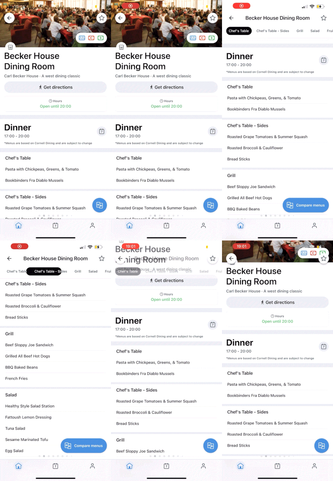
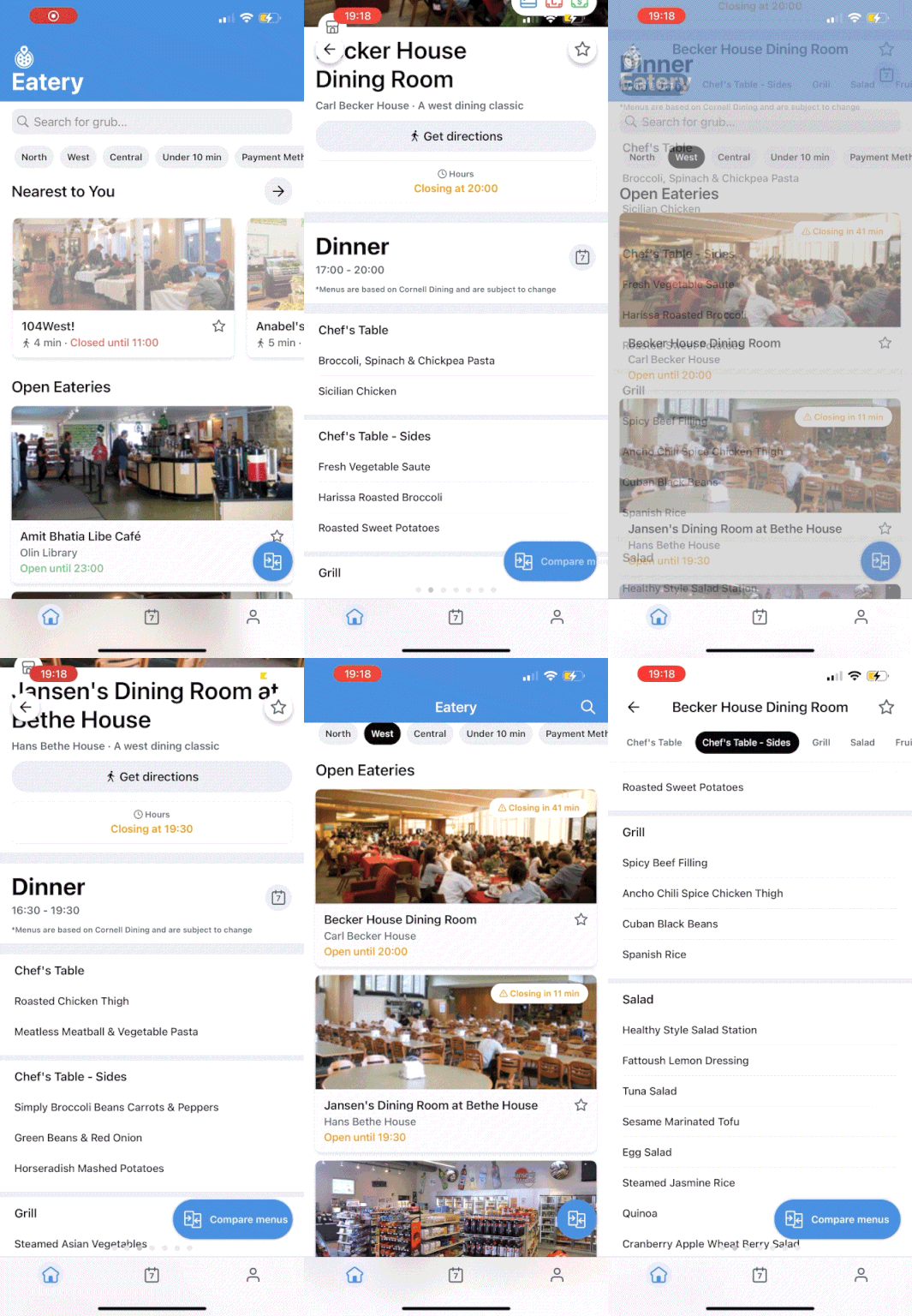
Users have to locate their eatery, scroll through the menu, click out of the eatery, click into another, and maybe go back to the previous menu they were looking at until they've made a dining decision.
This process is inefficient.
How might we decrease the time spent making a dining decision?
THE PROBLEM
THE SOLUTION
Compare menus
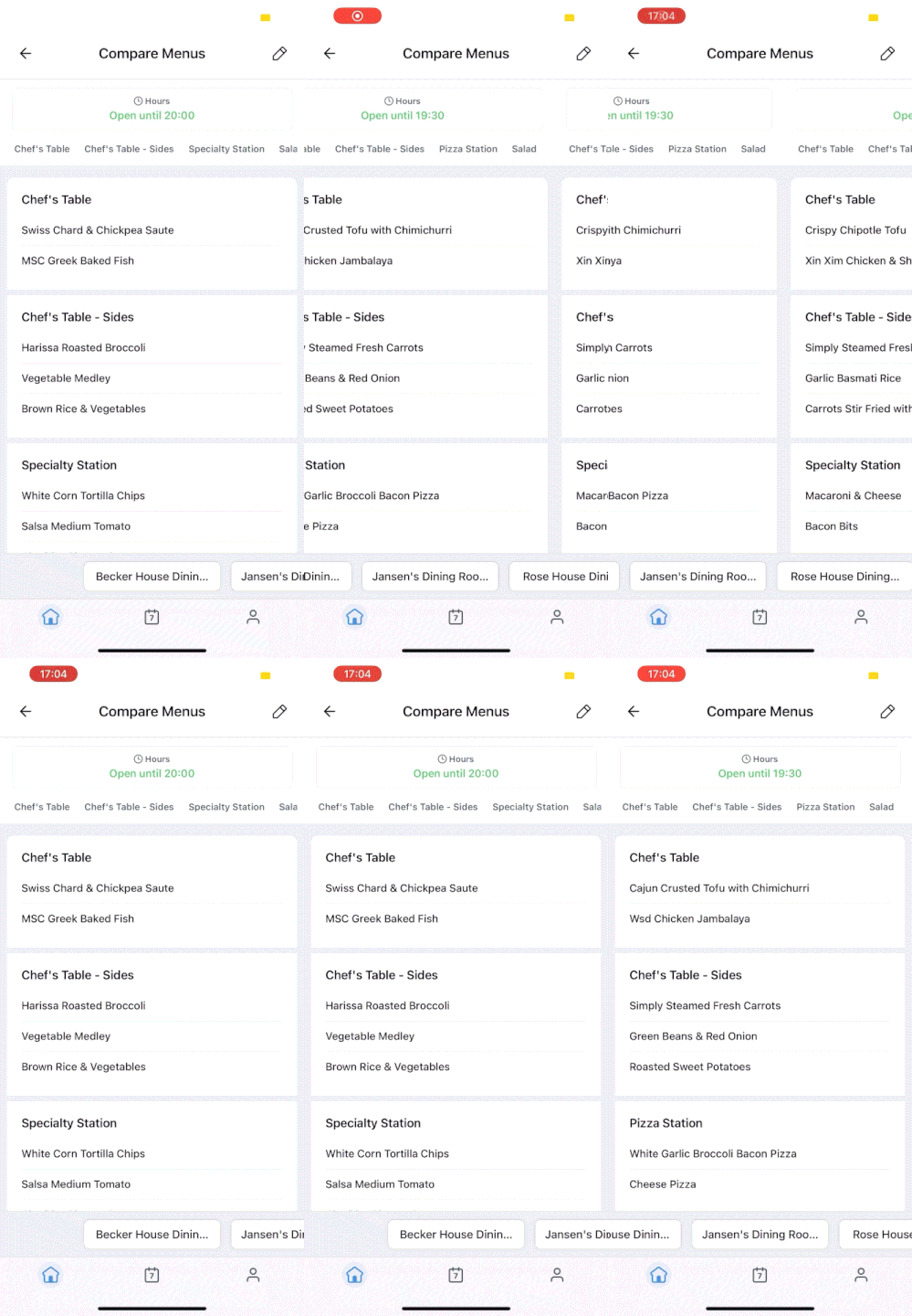
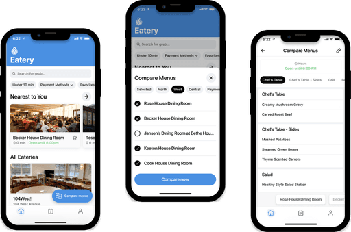
A way for users to view and compare multiple eatery menus in an efficient and seamless way.
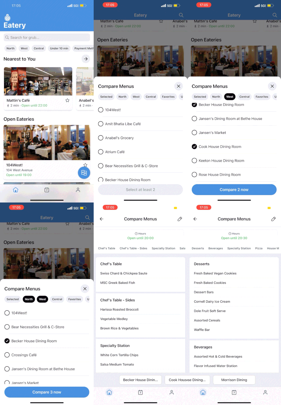
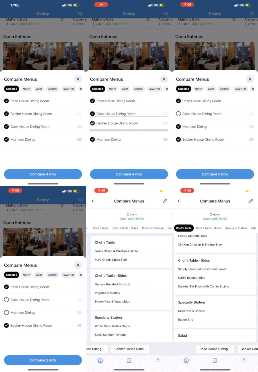
Select which eatery menus you want to compare with the single click of a button.
Compare menus
Seamlessly compare menus with easy swiping and tapping between tabs.
RESEARCH
Seeing how users feel about Eatery and comparing menus
Before beginning designing, I sent out a survey to understand pain points in Eatery’s current design system and to guide our feature roadmap.
I received 67 survey responses and gathered the following:
I came to the conclusion that looking through multiple dining halls is currently very unintuitive and there is a clear need from users to improve the decision making experience.
78% of users used the location filter to sort Eateries by location. Meaning most users are using the app to look at multiple dining options especially by location.
Additionally, filtering by location results in viewing minimum 8 eateries and maximum 24 eateries.
The average user looks through at least 3 eateries, meaning a need to easily compare menus is validated.
~80% of user said they would find a feature for comparing menus to be helpful.
“I think comparing menus could be useful so that I don’t have to go back and forth between menus, but I’m not really sure what this would look like. I worry that the comparison might be too busy on the screen.”
“When going to a dining hall I definitely compare menus, so a feature for this would be helpful and easier to navigate.”
“Currently I click one dining hall, exit, then click another one to decide what to eat. It’s a bit tedious to decide where to eat because i forget what’s being served”
EXPLORATIONS
How might we make comparing eatery menus seamless and intuitive?
Entry point
From page analytics, I learned users currently spend the most time on the homepage, meaning most navigation and decisions are made from the homepage (sorting eateries through filters and navigating back and forth between menus).
This justified exploration of a compare menus button on the homepage.
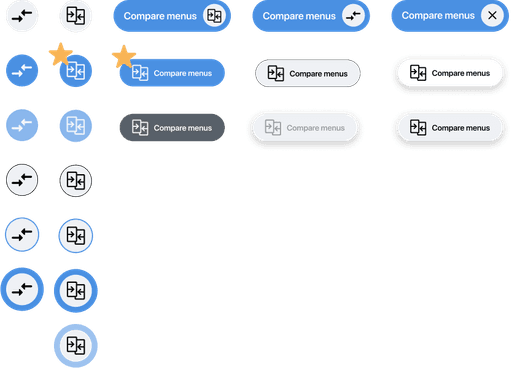
Through testing, I received feedback that the starred icon was the clearest to understand the function of the button. It also fit in the best with Eatery’s current design system.
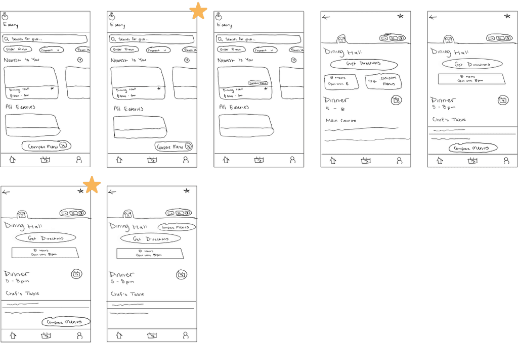
Button Placement lo-fi explorations:
I decided on keeping the button in the bottom right corner. I didn’t want the feature to be forced upon the user. Instead, it should be a tool handy for use.
Next, I deliberated which scroll direction would trigger expansion vs collapsing.
In my final design, I had the compare menus button start closed and open when scrolling down. This draws attention to the user as they are scrolling though the homepage or a menu, encouraging them to engage with the feature.
Creating high affordance through interaction
I began to think “how can we clearly indicate to users this button is meant to be clicked to compare menus?”
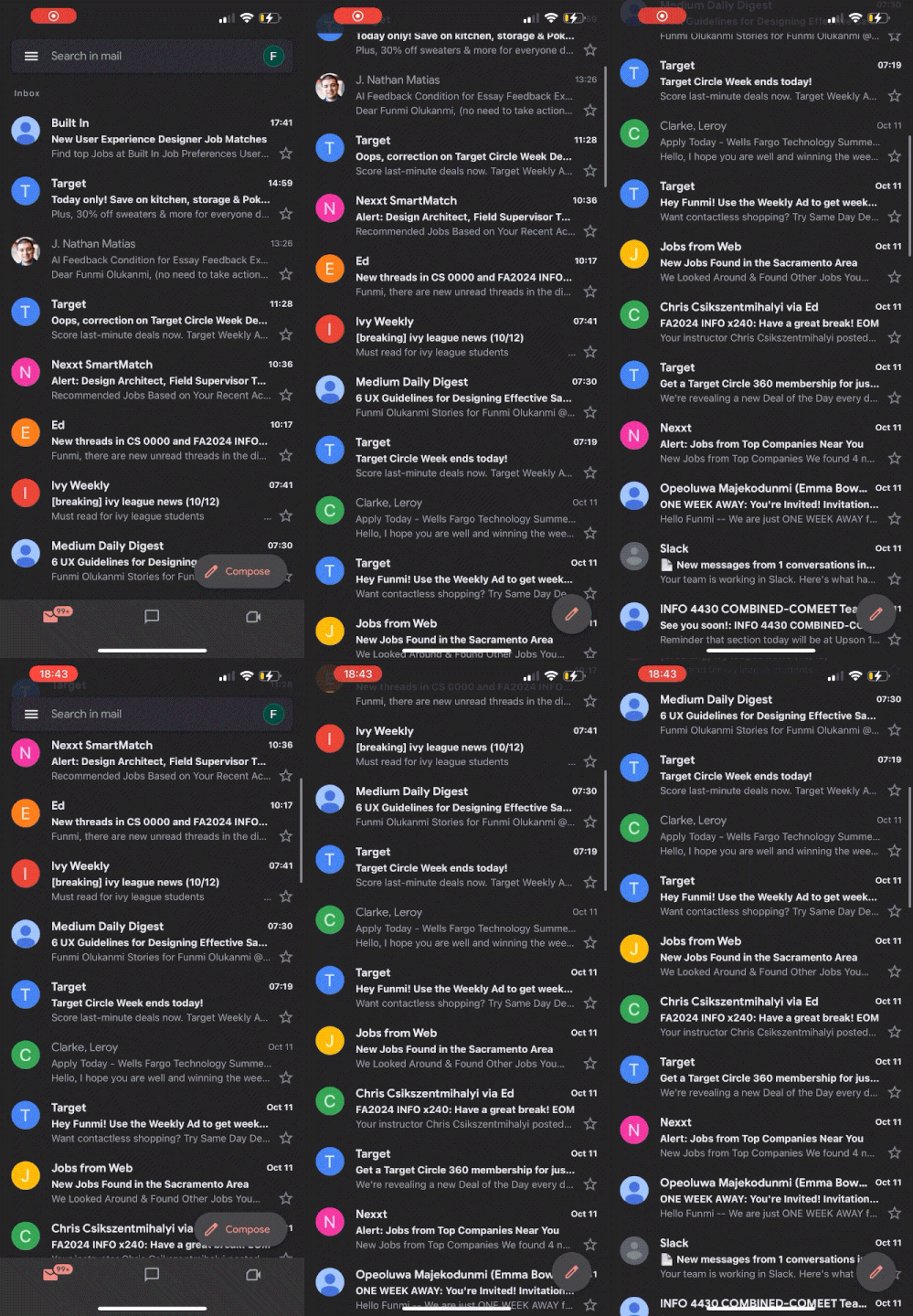
In order to ensure the button had high affordances, I decided to explore an expandable button triggered by scrolling. I took inspiration from Google GMail’s expandable “Compose” button.
This helped make sure:
Users could see the button
Users would understand the button’s function beyond the icon
EXPLORATION (CONT.)
How do users select menus to compare?
I explored ways to select different eateries to compare from the homepage:
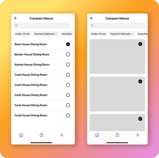
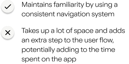
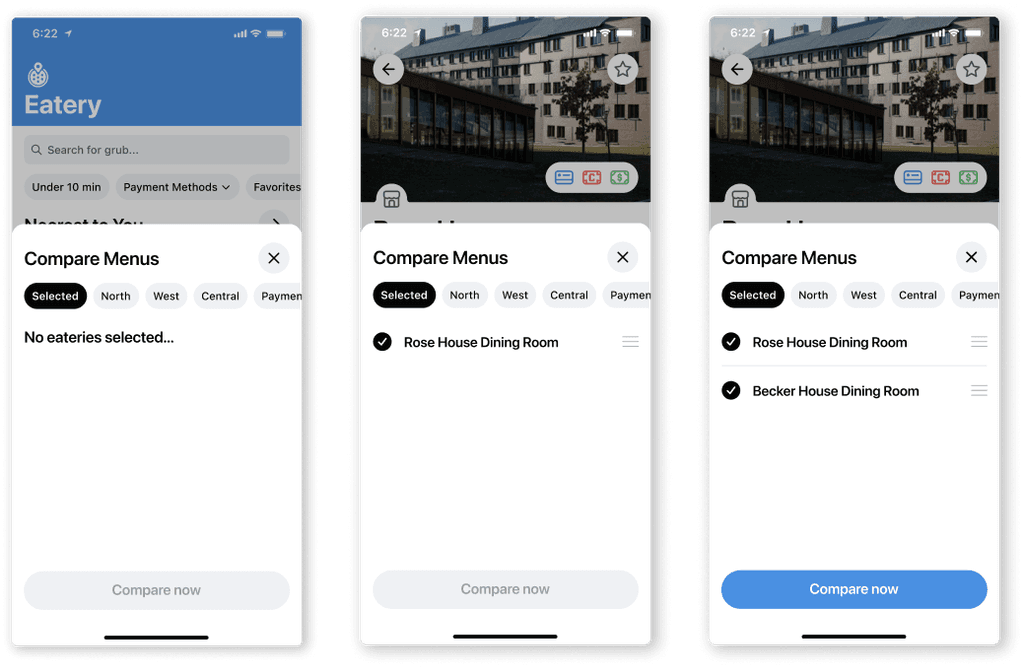
Full page vs modal
I primarily explored selecting eateries to compare through a full page and a modal.
How do users compare menus?
Next I explored interaction when it came to actually comparing menus after they were selected.
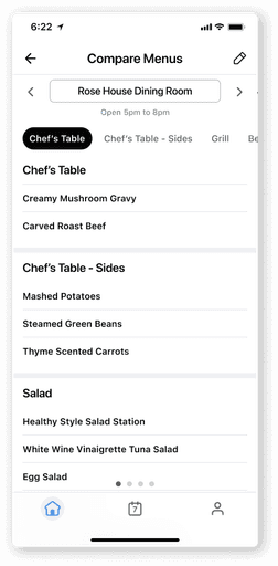
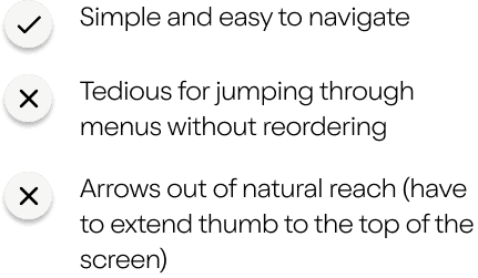
Swipe through
Swipe back and forth between different menus or tap arrows
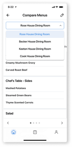
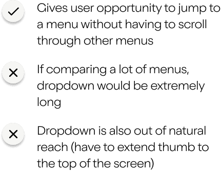
Swipe + dropdown
Swipe back and forth between different menus or use dropdown for navigation.
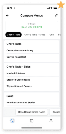
Tabs
Swipe back and forth between different menus or tap on an eatery tab
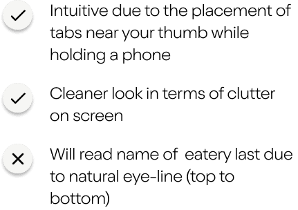
How do I ensure all edge cases are addressed?
While designing the feature, I came across a few edges that I addressed.
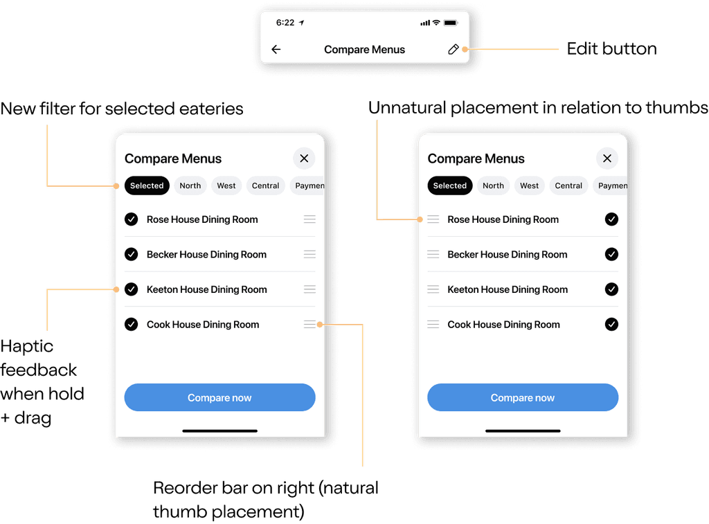
First, I thought about the case where a user would want to edit or reorder their selected menus. This would help prevent the tedious scenario where users have to restart the compare menus flow.
Next, I had to address the case where a user tried to compare with less than 2 eateries selected by not making the feature available until the requirements were met.
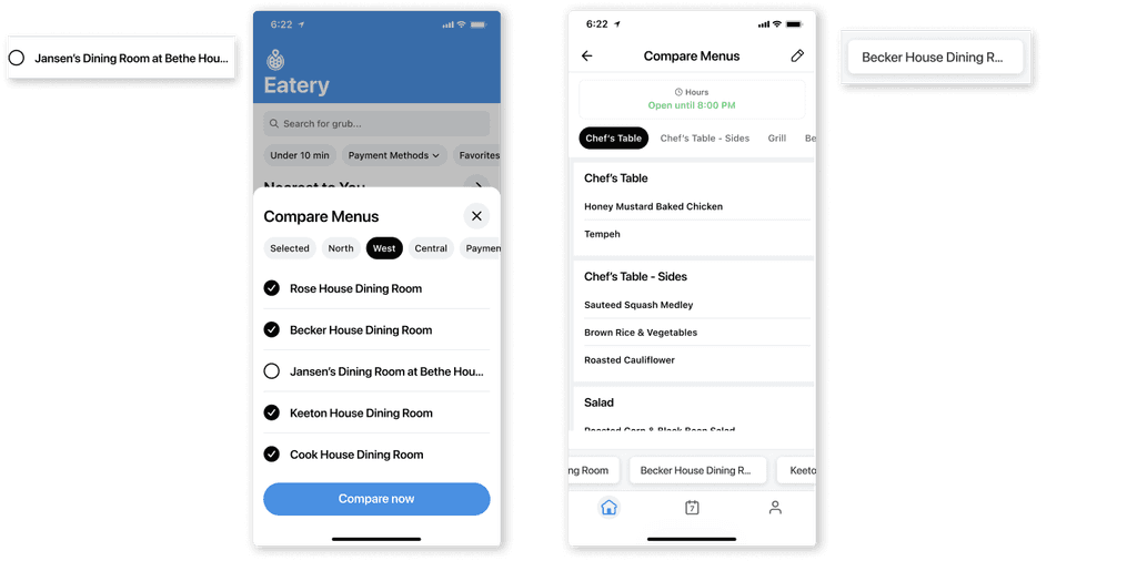
Finally, I addressed the case where an eatery name was too long for the compare menus modal or tabs by truncating long names.
TESTING
Understanding any pain points
I conducted user testing with ~50 users before shipping to the public.
Overall, users were highly satisfied with the design solution to the problem. However, there were a few things uncovered through testing.
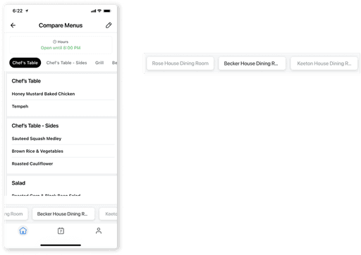
10 people said they were confused about which eatery menu they were looking at when comparing menus.
To address this, I added variations between active and inactive tabs when swiping through different menus. Inactive tabs would now be gray to differentiate between the two
Additionally, 7 users were confused about how to begin using this new feature once on the compare menus page.
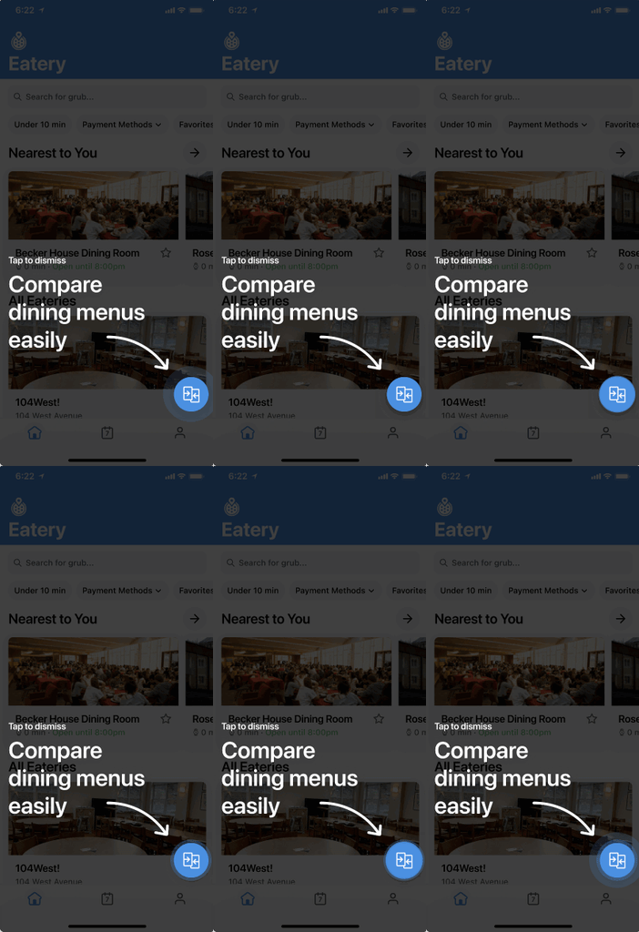
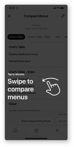
To address this, I added tutorial screens for first-time encounters with the feature in order to explain how to use it and avoid overwhelming users with the change.
RESULTS
Final prototype and success metrics
Compare menus final flow
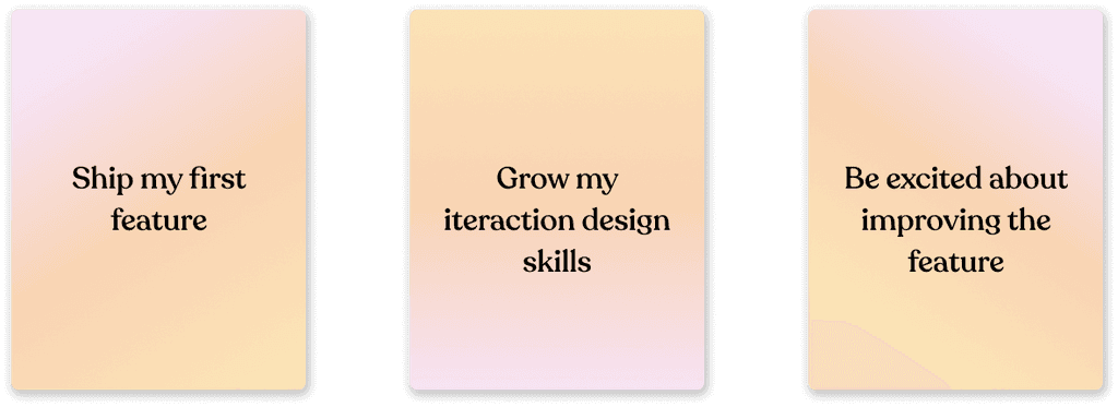
Reflecting on this project, I’ve learned so much and grown tremendously as a designer.
I got to...
I’m looking forward to continue testing this feature to help Cornell students make quicker, more informed dining decisions
A month after launch, the average time on the app went down by 30 seconds
I plan to continue monitoring time spent on the app, as well as analytics from the compare menus button and page to measure success and improve the feature.


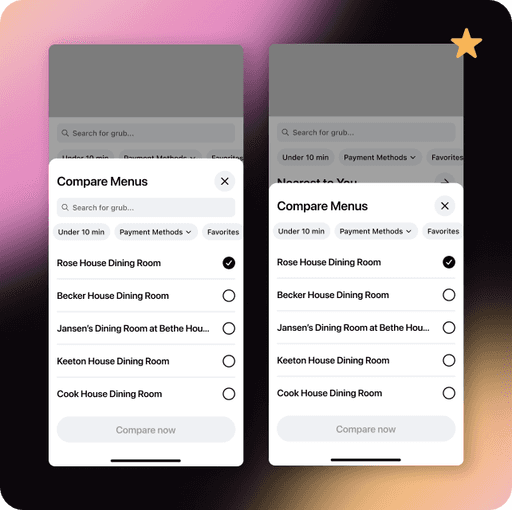

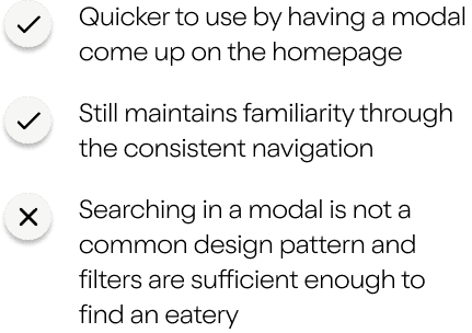
When exploring modals, I also had to consider searching vs filtering eateries.


TEAM
3 developers
1 designer
2 marketers
1 product manager
ROLE
Product Designer
TIMELINE
Jan 2024 - April 2024
TOOLS/SKILLS
Figma
Interaction Design
UXR


CONTEXT
What is Eatery?
Eatery is Cornell’s premier dining hall app for students to learn about all information related to eateries on campus.
Hi, I'm Funmi - a product designer passionate to crafting digital experiences that empower users
I'm currently working on the mobile version of my site to ensure visitors have the best experience possible!
Please view my portfolio on a desktop if possible! Or feel free to view my resume!
:・゚✧*:・゚✧