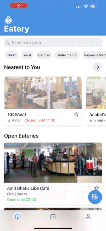
[Eatery]
Faster Dining Decisions with Compare Menus

Reducing friction in the dining decision process with improved interaction design
[Project Overview]
Eatery is Cornell's go-to app for all information related to dining. It has served over 10k MAU for more than a decade. In this project, I led the design for Compare Menus, a feature that allows users to compare dining menus quickly and effectively.
[Problem Statement]
How might we reduce any friction adding to the overall time spent on the app and help users make quick dining decisions?
[My Role]
Product Designer
[Team]
3 developers
1 PM
1 designer
2 marketers
[Platforms]
iOS and Android
[Timeline]
January 2024- April 2024
[Context]
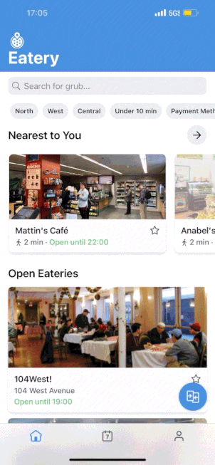
What is the current flow for making a dining decision?
The current average time spent on the app is 5 minutes and 36 seconds.
[Current Flow]
Open app
Locate an Eatery menu
Click on the Eatery
Scroll through the menu
Click out of the Eatery menu
Click into a new Eatery menu
Scroll through the menu
Go back to the first menu for a refresh
Repeat until a decision is made
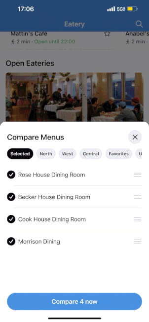
[The Solution]
Compare Menus
A way for users to view and compare multiple eatery menus in an efficient and seamless way.

Select which eatery menus you want to compare with the single click of a button.
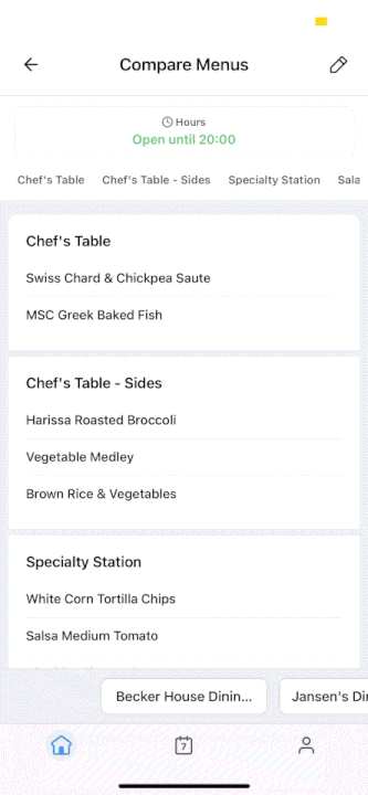
Seamlessly compare menus with easy swiping and tapping between tabs.
[Research]
Seeing how users feel about Eatery and comparing menus
Before beginning designing, I sent out a survey to understand pain points in Eatery’s current design system and to guide our feature roadmap.
I received 67 survey responses and gathered the following:
[01] The current flow for comparing menus is extremely tedious
“Currently I click one dining hall, exit, then click another one to decide what to eat. It’s a bit tedious to decide where to eat because i forget what’s being served.”
[02] Users digest information better in simpler/minimal formats
"I’m not really sure what this would look like. I worry that the comparison might be too busy on the screen.”
[03] Looking at multiple menus is a part of the primary user journey
"When going to a dining hall I look at different menus on Eatery depending on where I am to decide where to eat."

Additionally, 78% of survey respondents use the location filter when browsing eateries, supporting that most users rely on the app to explore multiple dining options within a specific area.
When filtering by location, users can view between 8 and 24 eateries, with an average of 3 menu views per session. This behavior highlights a clear need for easier menu comparison considering the tedious current flow.
[Explorations]
Entry Points
App analytics revealed that users spend the most time on the homepage, which serves as the main place for filtering eateries and navigating between menus. This insight suggested that key decision-making happens here, which justified exploring the feature directly on the homepage.

Usability testing showed that the starred buttons were the most intuitive representation of the comparison feature. It best aligned with users’ expectations and fit within Eatery’s existing design system.
Creating high affordance through interaction
I began to think “how can we clearly indicate to users this button is meant to be clicked to compare menus?”
[Inspiration from GMail]
In order to ensure the button had high affordances, I decided to explore an expandable button triggered by scrolling. I took inspiration from Google GMail’s expandable “Compose” button.
This helped make sure:
Users could see the button
Users would understand the button’s function beyond solely the icon
Made the button feel like a readily available tool
Next, I deliberated which scroll direction would trigger expansion vs collapsing.
In my final design, I had the compare menus button start closed and open when scrolling down. This draws attention to the user as they are scrolling though the homepage or a menu, encouraging them to engage with the feature.
[Explorations Cont.]
How do users select menus to compare?
I explored ways to select different eateries to compare from the homepage:

[Full Page]
I primarily explored selecting eateries to compare through a full page and a modal.
+ Maintains familiarity by using a consistent navigation system
- Adds an extra step to the flow and takes up a sufficient amount of space, potentially adding to the dining decision time
[Modal]
When exploring modals, I also had to consider searching vs filtering eateries.
+ Quicker to have a modal come up on the homepage
+ Still maintains familiar and consistent navigation
- Searching in a modal requires more eng effort and filters are sufficient enough to find an eatery

Usability testing showed that the starred buttons were the most intuitive representation of the comparison feature. It best aligned with users’ expectations and fit within Eatery’s existing design system.
How do users compare menus?
Next I explored interaction when it came to actually comparing menus after they were selected.

[Swipe Through]
Swipe back and forth between different menus or tap arrows
+ Simple and easy interaction
- Tedious for jumping through menus without reordering
- Touchpoint for arrows out of natural reach (have to extend thumb to the top of the screen)

[Swipe + Dropdown]
Swipe back and forth between different menus or use dropdown for navigation.
+ Gives user the opportunity to jump to a menu without having to scroll through other menus
- If comparing a lot of menus, dropdown would be extremely long and cluttered
- Dropdown is also out of natural reach

[Tabs]
Swipe back and forth between different menus or tap on an eatery tab
+ Intuitive and convenient due to the placement of tabs near your thumb while holding a phone
+ Cleaner look and minimal clutter
- Will read name of eatery last due to natural eye-line (top to bottom)
[Refinements]
How do I ensure all edge cases are addressed?
While designing the feature, I came across a few edge cases that I addressed along the way.
First, I thought about the case where a user would want to edit or reorder their selected menus. This would help prevent the tedious scenario where users have to restart the compare menus flow.

Next, I had to address the case where a user tried to use the feature with less than 2 eateries selected.

Finally, I addressed the case where an eatery name was too long for the compare menus modal or tabs by truncating long names.

[Testing]
Understanding any pain points
I conducted user testing with ~50 users before shipping to the public. Overall, users were highly satisfied with the design solution to the problem. However, there were a few things uncovered through testing.
10 people said they were confused about which eatery menu they were looking at when comparing menus.
To address this, I added variations between active and inactive tabs when swiping through different menus. Inactive tabs would now be gray to differentiate between the two

Additionally, 7 users showed delay when prompted to initially engage with the feature.
To address this, I added tutorial screens for first-time encounters with the feature in order to explain how to use it and avoid overwhelming users with the change.


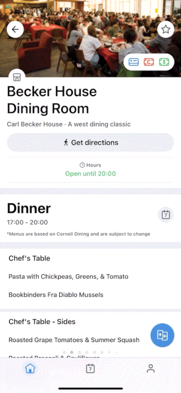
[Final]
Compare menus final flow
A month after launch, the average time on the app went down by 30 seconds
I plan to continue monitoring time spent on the app, as well as analytics from the compare menus button and page to measure success and improve the feature.
Designing beyond the interface
I improved in thinking critically about how a feature fits into the larger product ecosystem, not just how it looks or feels, but how it drives user and success metrics.
Deepened my understanding of interaction
This project challenged me to be intentional about microinteractions, hierarchy, and motion. I started viewing these not as polish, but as essential tools for usability and clarity.
Learning to collaborate through ambiguity
Working with PMs and engineers taught me to communicate design intent clearly, prioritize effectively, and adapt when technical constraints reshaped my initial vision.
Growth through iteration
Each testing round reinforced the value of small, focused improvements. I left this project with a stronger belief that iteration is where thoughtful design truly takes shape.